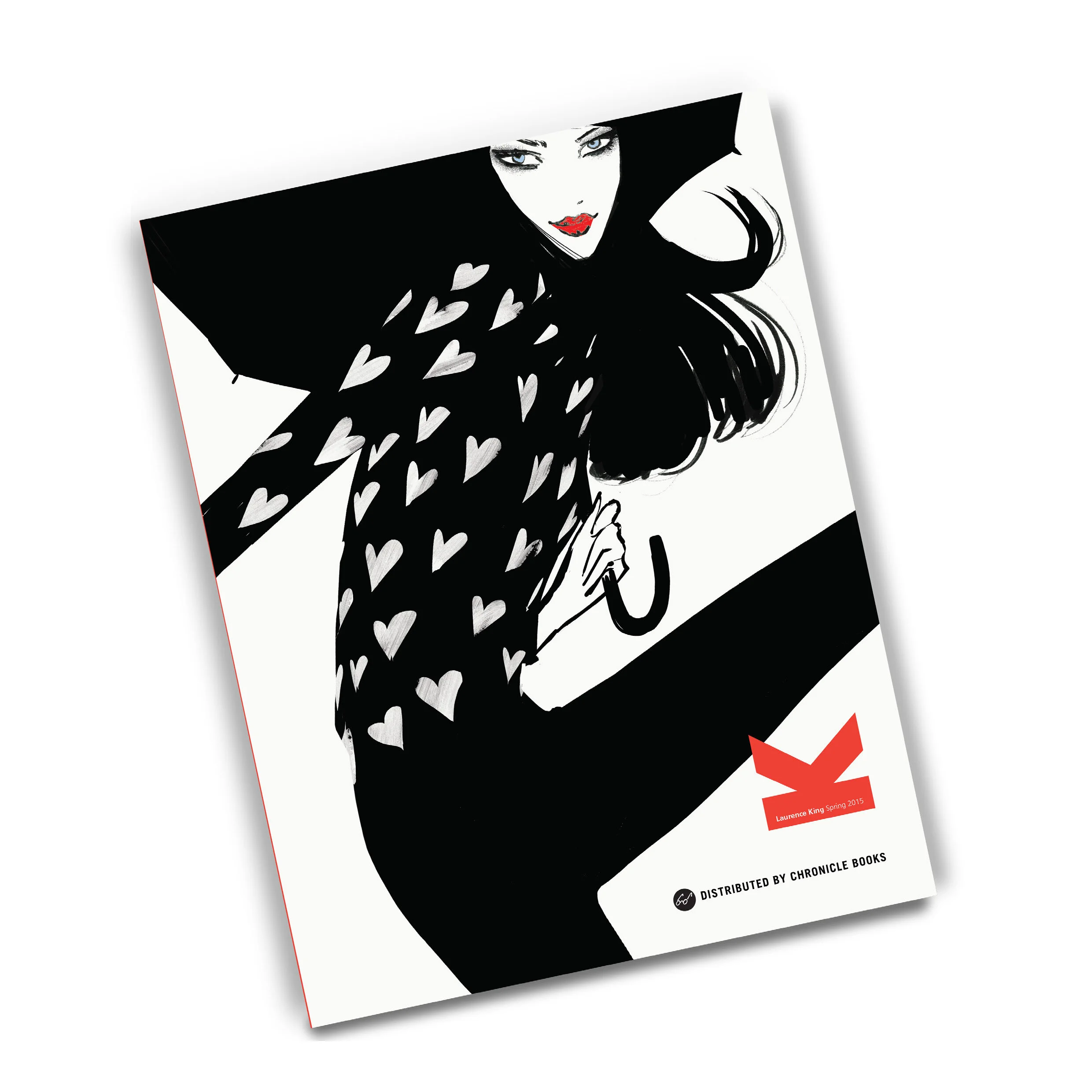
Laurence King Publishing
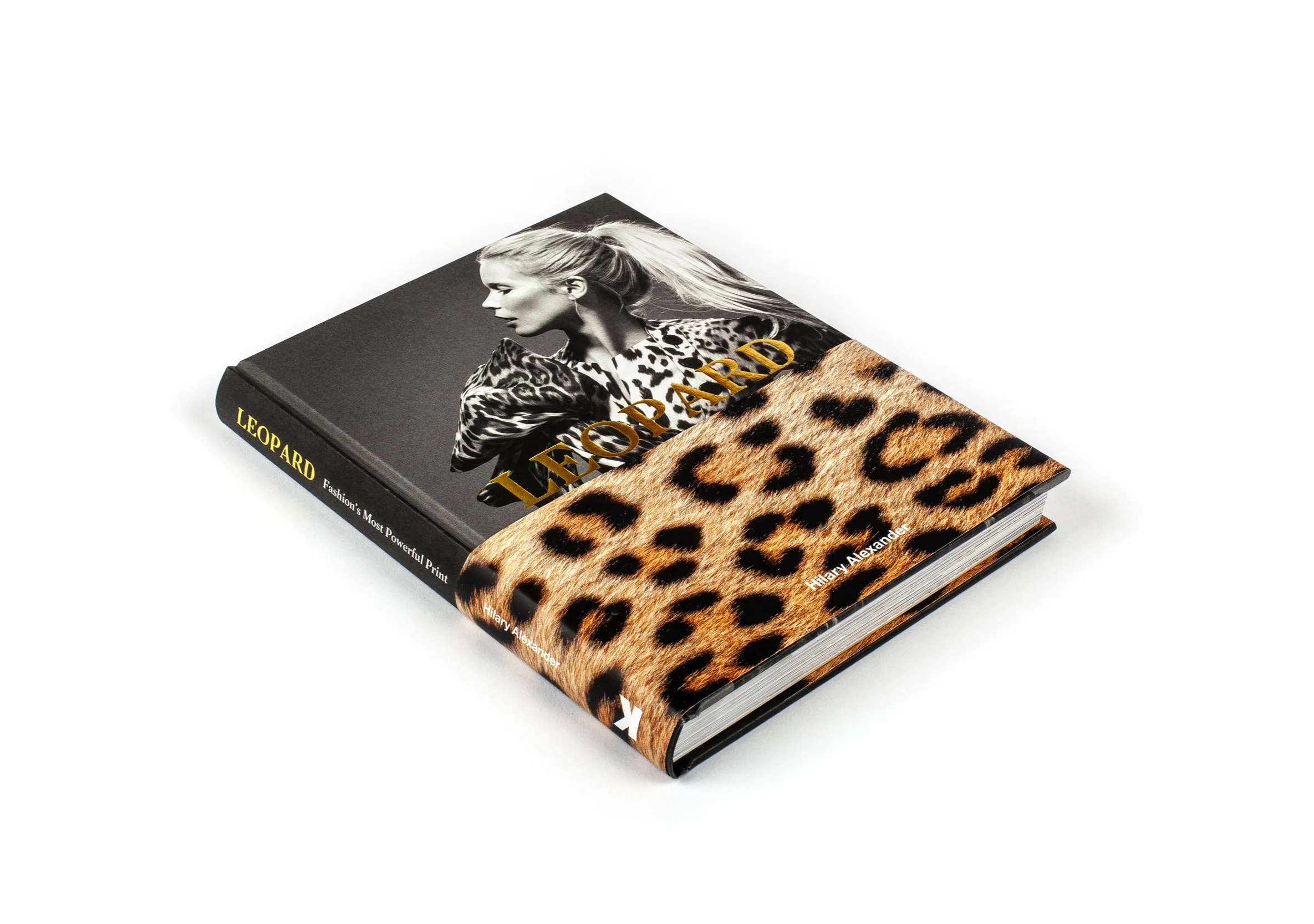
An illustrated book exploring the enduring appeal of fashion’s most powerful print.
Written by award-winning journalist Hilary Alexander and with quotes by Donatella Versace, Diane von Furstenberg and Claudia Schiffer, Leopard is a must-have for fashion aficionados and a valuable resource for fashion designers and stylists.
I designed a simple layout to support a potent crop of images, subtly echoing the feline rhythms through block colours and characterful type.
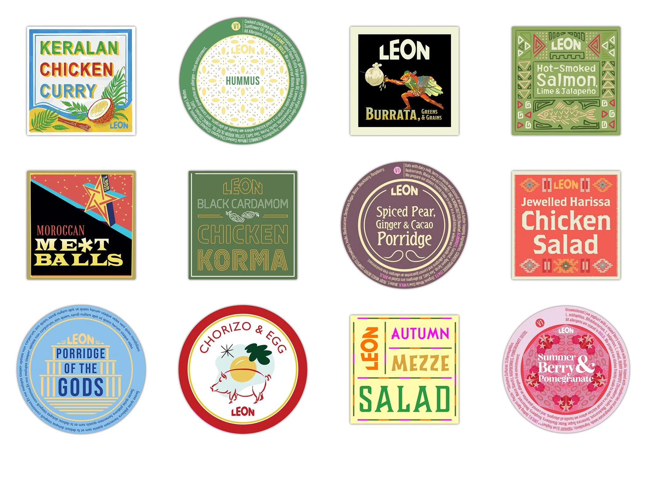
Marketing for each menu Launch at LEON starts and ends with their iconic stickers, which have become collectors items for fans of the brand. Each one a highly creative project to convey the flavour and inspiration for each new dish. They then form the backbone of menu design and a wide range of promotional material.
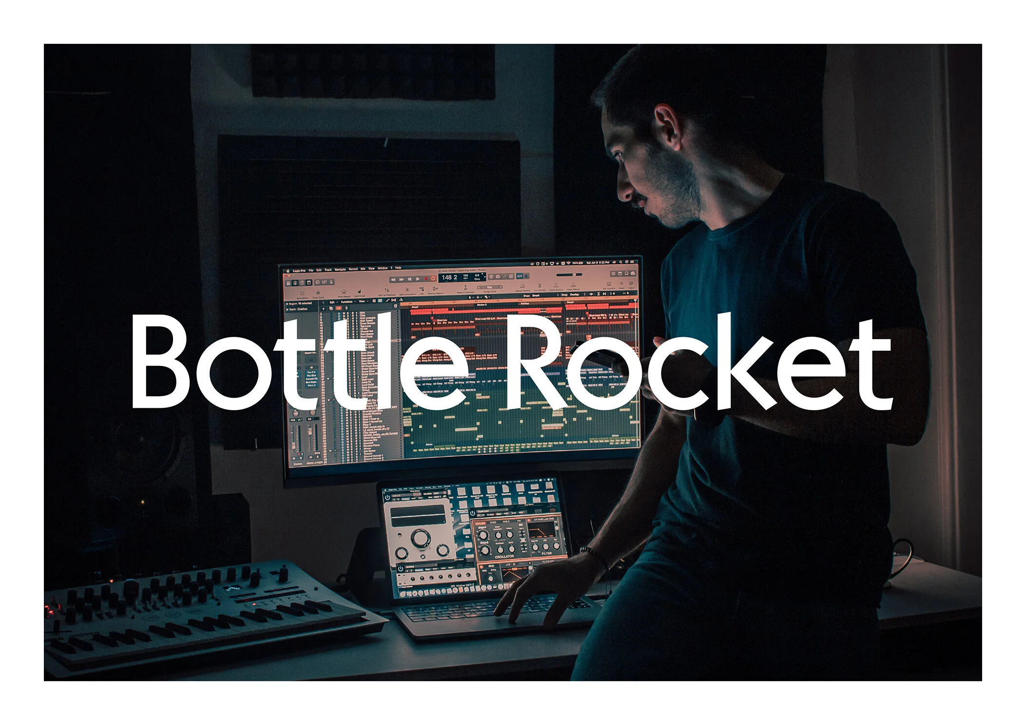
A new brand for a sound engineer seeking to bridge the gap between his roots in the ‘DIY punk’ scene and a more upmarket clientele.
The identity spans a range of media – celebrating the retro quirks of analogue recording – where nerdish, technical mastery meets playful musicianship. Its ‘reel of tape’ logo is the centrepiece of a revamped website featuring the Notes from the Studio blog, which shares insights into his meticulous creative process.
The concept is further brought to life in a short animation that follows the tape, twisting and turning its way through the recording machine.
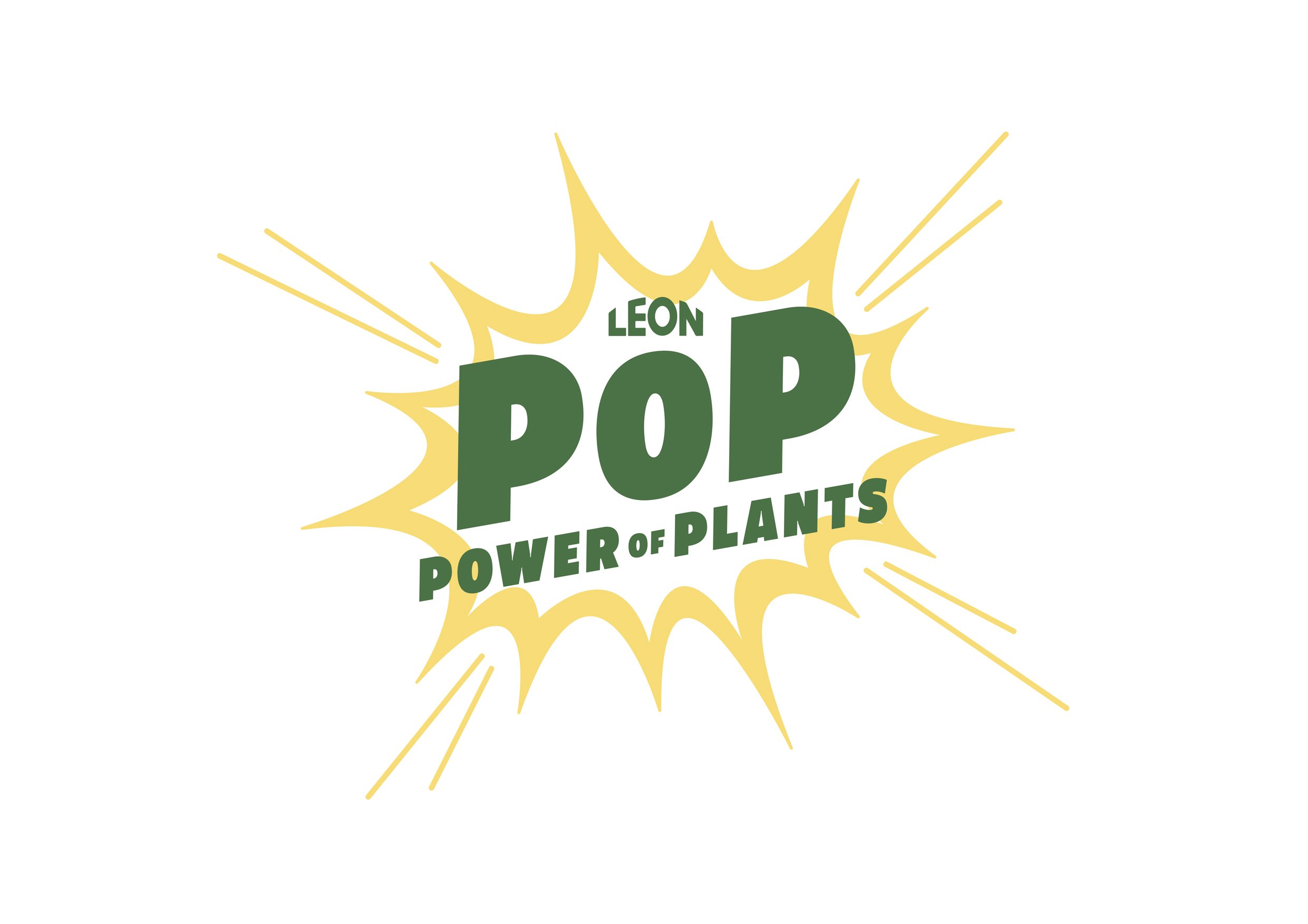
Leon’s new year menu packs a punch to reaffirm their founding principle of ‘Naturally Fast Food’.
With the vibrant visual stimulus of ‘pop art’ as its inspiration – ‘Power of Plants’ is a celebration of beautiful ingredients. We bring the ornate beauty of each vegetable into sharp – almost obsessive – focus, reflecting the meticulous care taken to create each dish.
The colourful visual language invigorates with an energetic sense of fun – further brought to life with animations – displayed on restaurant screens and in social campaigns. Among the details is a ‘plant content counter’, to further extol the health benefits packed into each hearty dish, that will also make you smile on the inside.
Laurence King Publishing
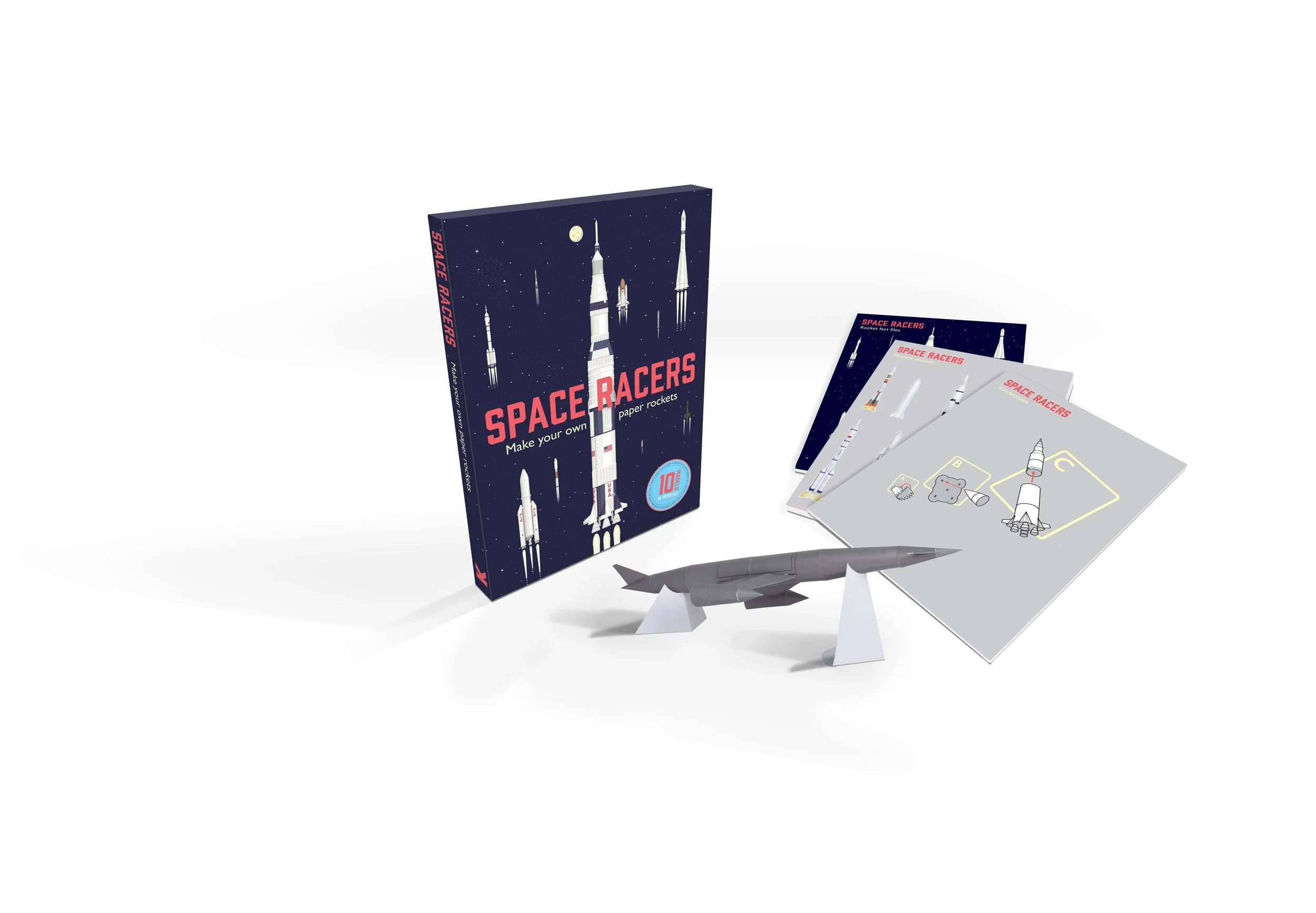
A fun-packed children’s book on space rockets, centred around paper modelling.
Written by Isabel Thomas, the book is split into 3 sub-booklets: The first being a beautifully illustrated visual history of rocketry. The second and third are a set of colourful rocket templates and instructions on assembly.
Space Racers was a deceptively challenging project, where children’s book aesthetics concealed some complex design problems. None more so than the rocket building instructions, which had to be simple enough for children, yet sufficiently intricate to convey some challenging crafting techniques.
The golden age of space exploration is reflected in the book’s retro style, which can be found in the smallest detail – on cut-away diagrams – and in the bold blocks of colour adorning the rocket models.
A campaign to showcase LEON’s summer menu. After a few seasons of enforced isolation, LEON wanted to celebrate memories of golden summers – spent with family and friends – as a platform for optimism and future growth. The visual language revolves around LEON’s collection of team family photos, unified beneath a logo evoking the pleasantly familiar ‘Mediterranean holiday park’ vernacular. A fitting addition to LEON’s often tongue-in-cheek ‘scrapbook chic’.
A visual identity promoting a vibrant club night in East London, showcasing live jazz, soul and funk. The artwork features primal brush strokes that echo the sense of ‘controlled chaos’, often found in the mastery of a musical instrument.
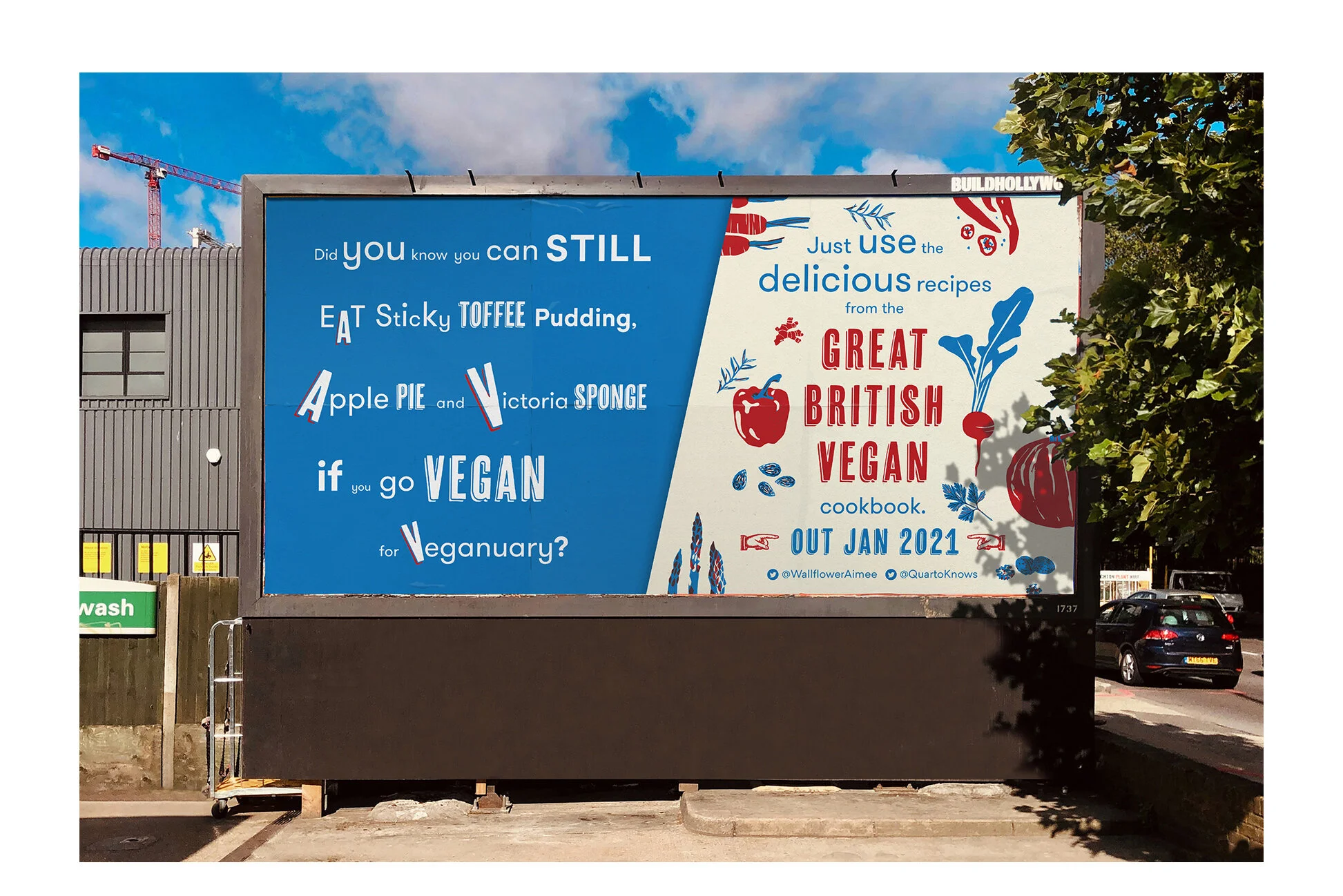
A playful campaign to promote a cookbook that suggests veganism doesn’t mean boring food!
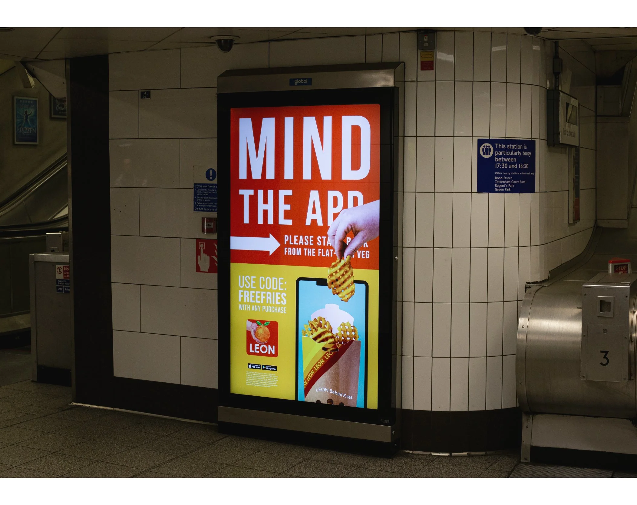
A creative campaign to launch LEON’s new remote-ordering loyalty App. The aim was to create a ‘fast-foodie’, colourful and humour-filled creative to lure new guests with the promise of free waffle fries. The assets adorned takeaway carier bags, in-store posters and were adapted for an animated out of home campaign across London’s tube network.
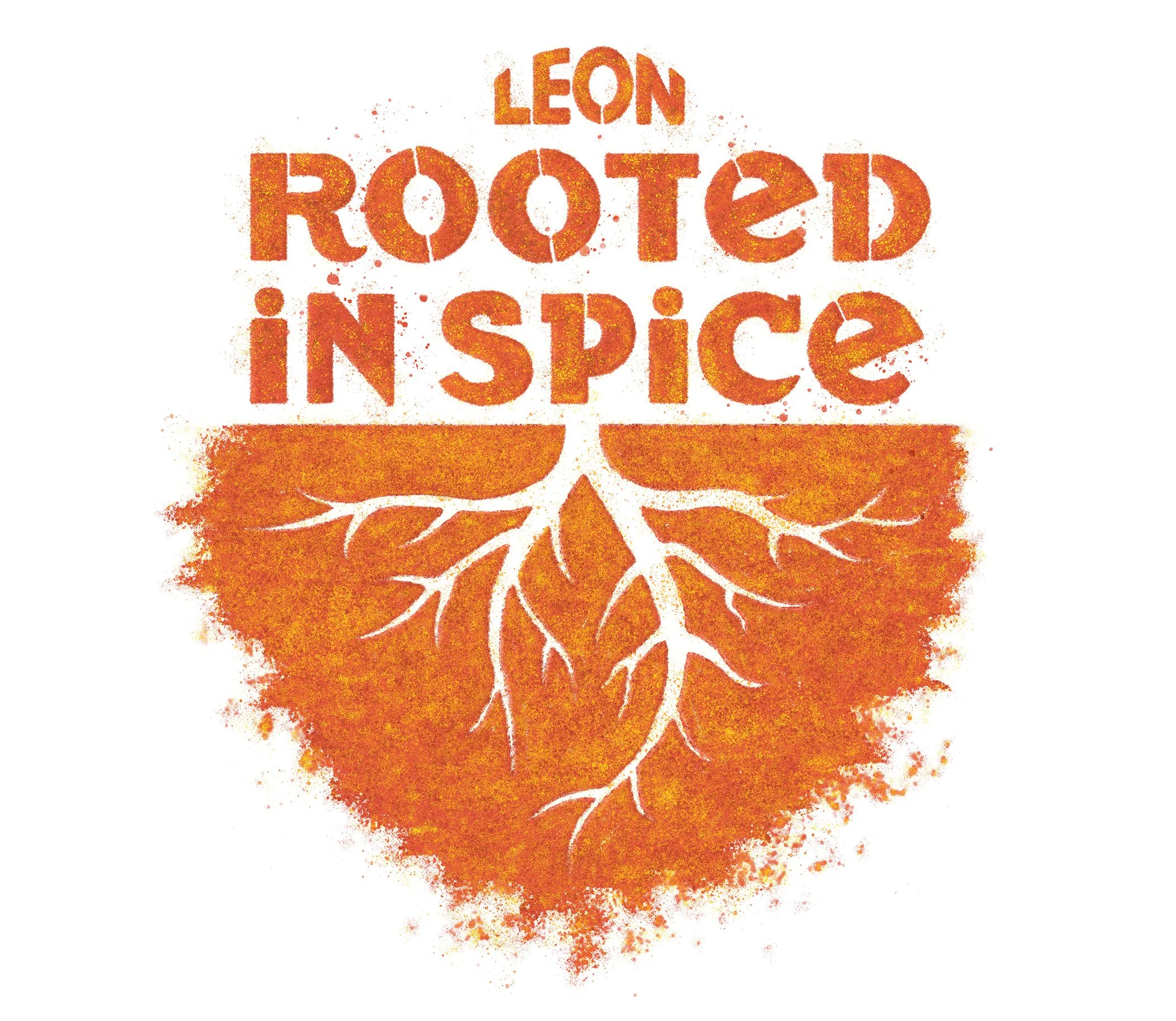
An Autumn campaign to warm the cockles as the nights draw in.
LEON wanted something earthy and tactile to reflect the origins of comforting recipes, rich in warming spices and wholesome vegetables. We devised a concept evoking vibrant spice markets, including a characterful stencil typeface mirroring a humble merchant’s brand mark.
Laurence King Publishing
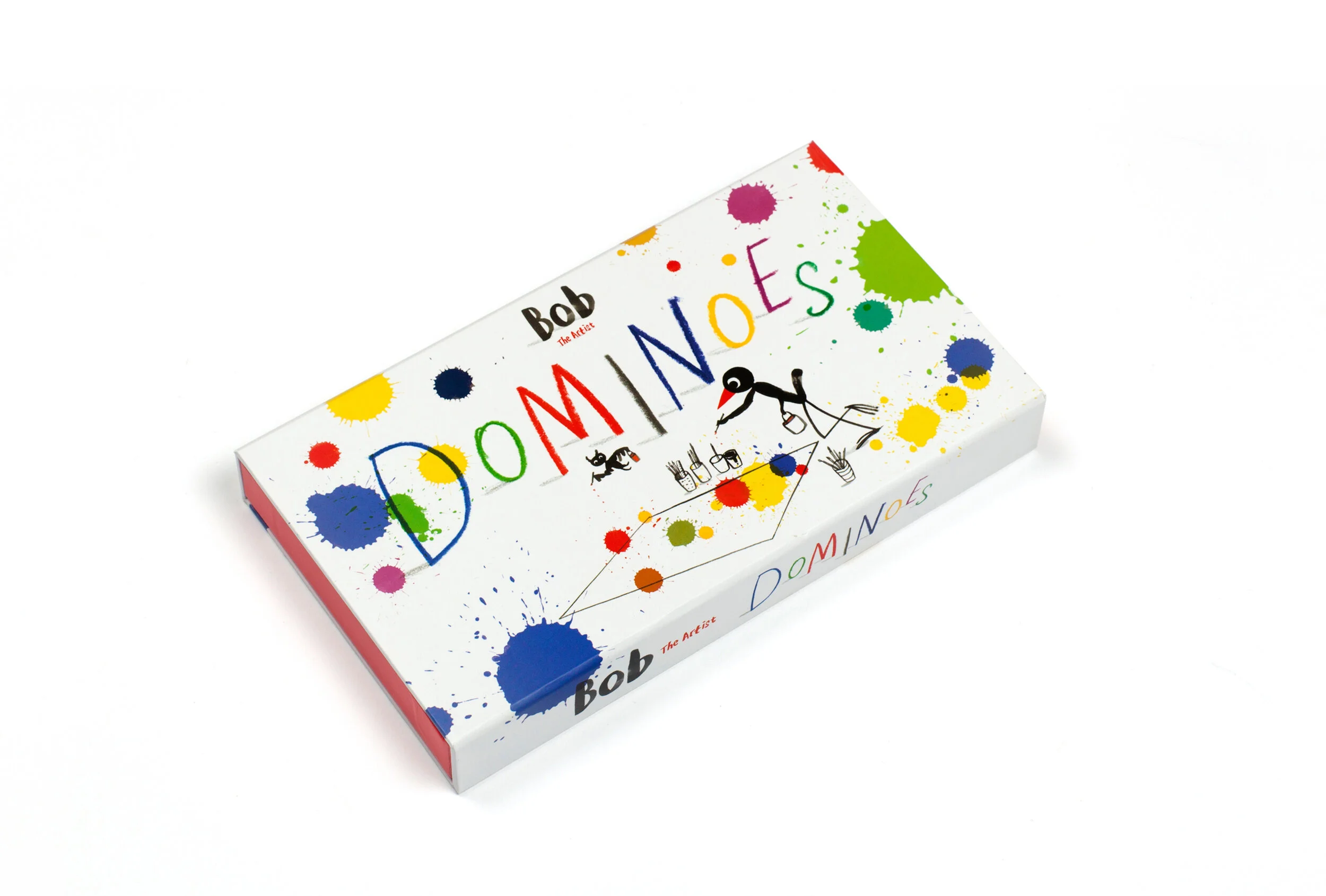
Award winning illustrator and author Marion Deuchars followed the success of her Bob the Artist books with a range of gifts. I worked closely with Marion to develop and arrange her drawings into a beautifully colourful game of dominoes.
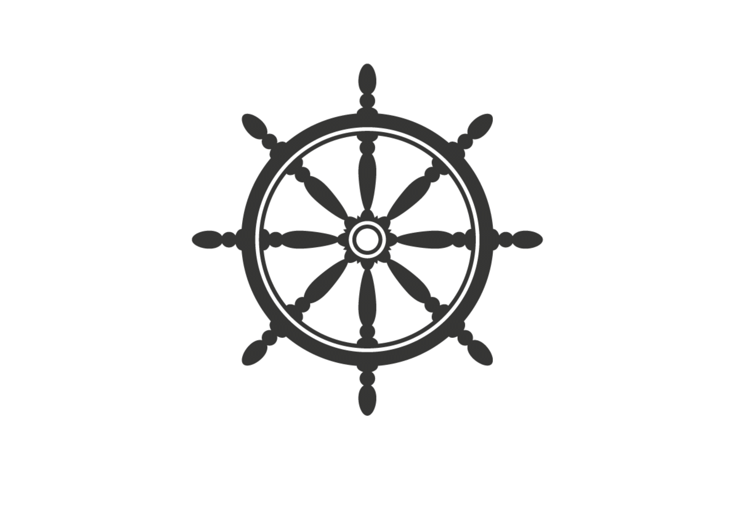
An arresting brand for a vibrant new bar in Worthing, using the image of a ship’s wheel as its focus. What began as a simple logo for a hanging sign developed into a visual identity, incorporating invoices, business cards and menus.
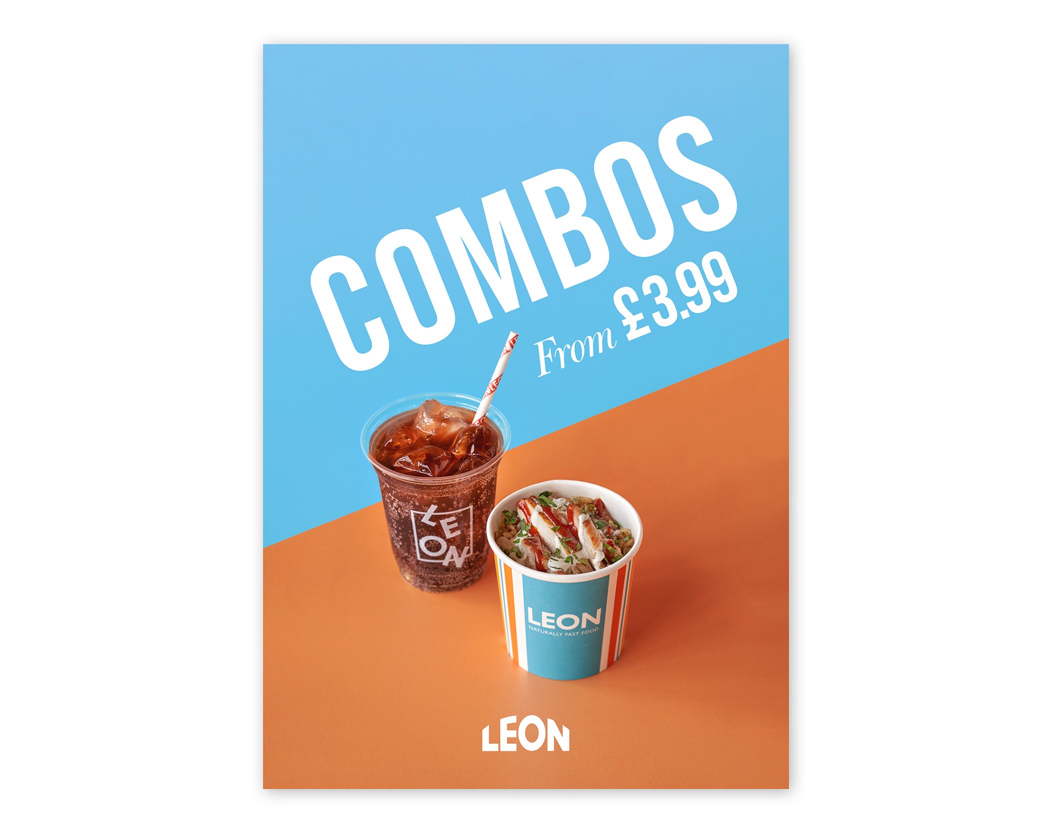
A selection of promotional posters for LEON.
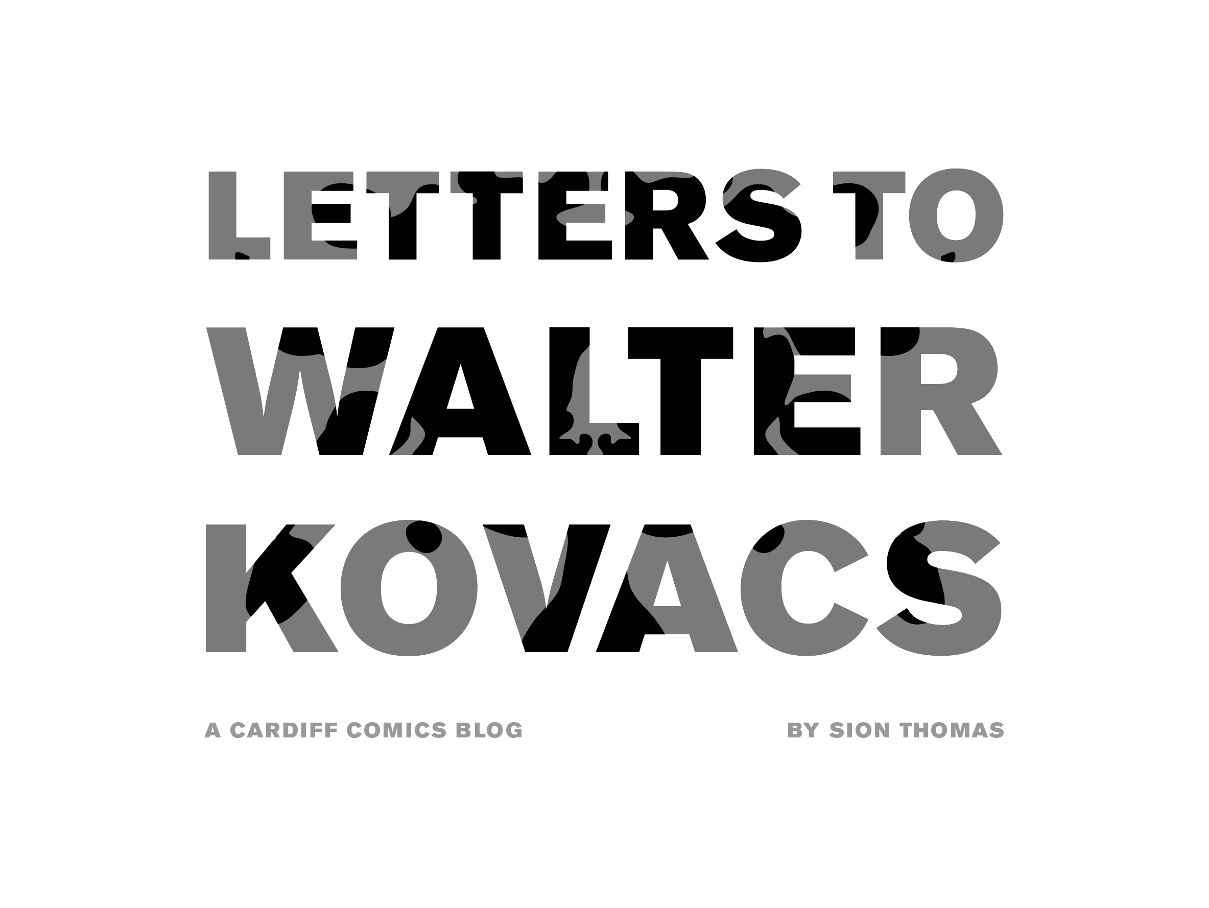
A visual identity for a comics blog that emerged from the DIY comic scene. The name of the blog is a reference to Rorschach from the Watchmen. His face is obscured by a crude mask covered in symmetrical ink stains that morph to reflect his state of mind. I followed this theme to create an animated masthead and tote bag designs.
Laurence King Publishing
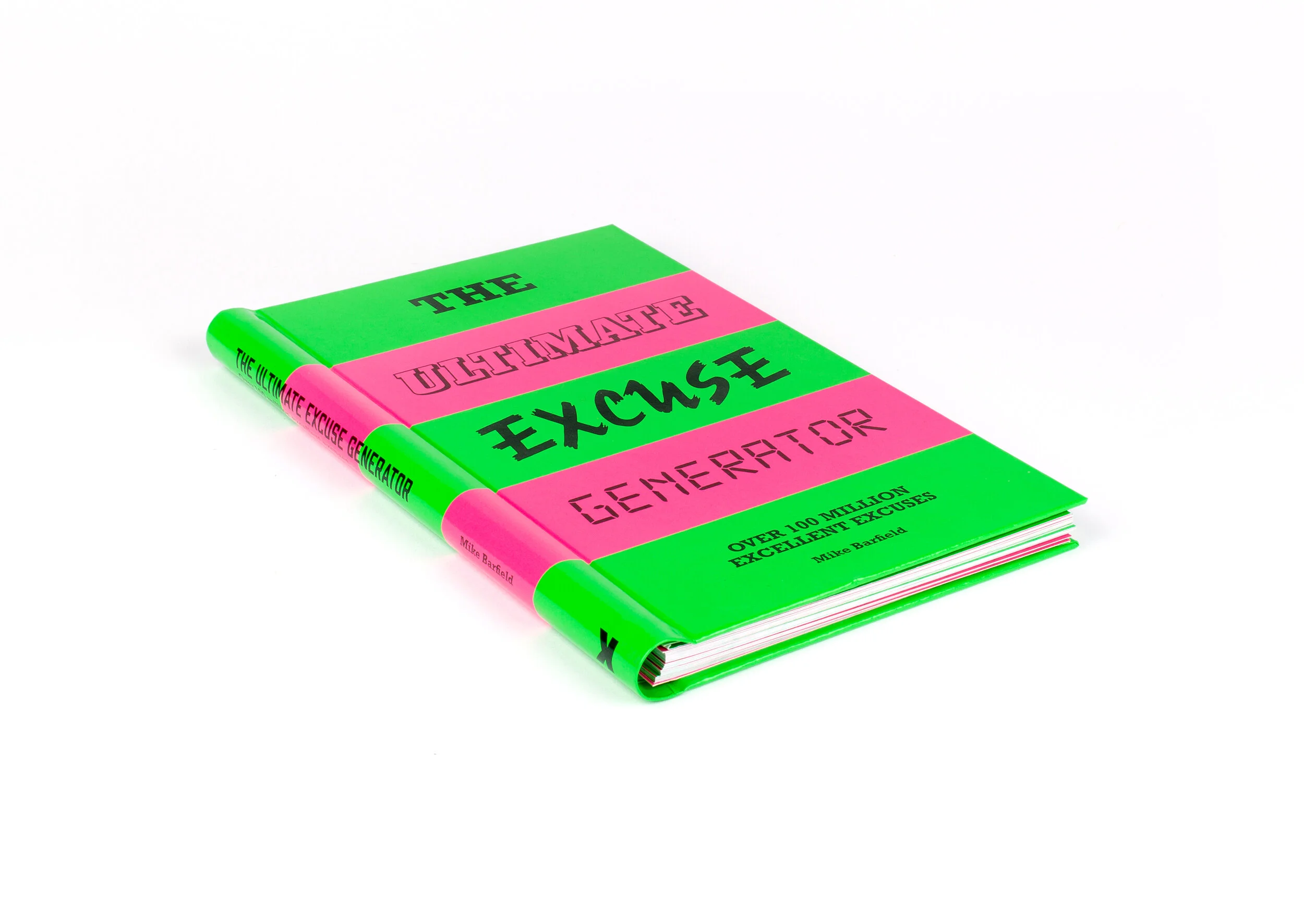
A visually offensive flipbook by comic writer Mike Barfield, that allows you to generate over 100 million excuses for any occasion.
The book dropped onto shelves dressed in a suitably unsightly neon colour scheme, with a truculent mob of fonts to furnish each tale. The inlays were adorned with a shabby – 'dingbat' inspired – pattern, reflecting details from the text.
Laurence King Publishing
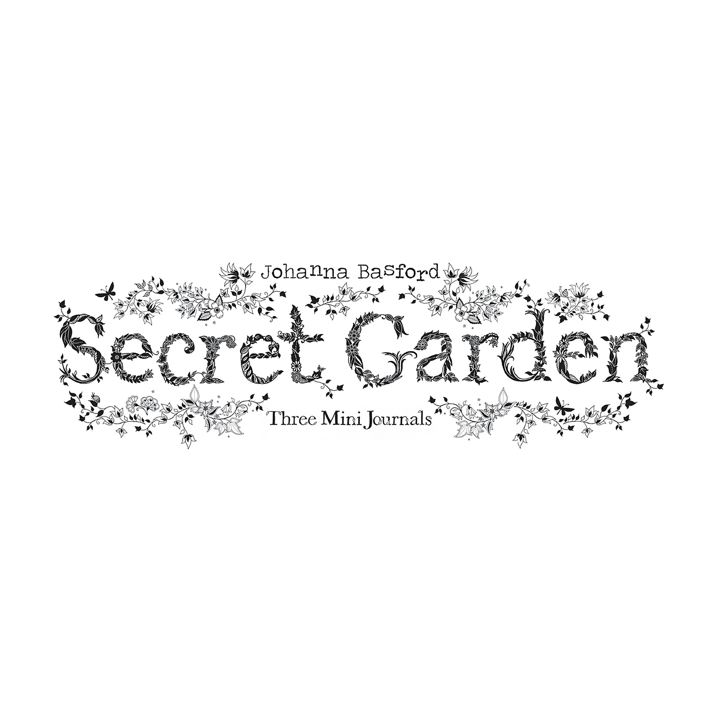
Johanna Basford’s Secret Garden was a worldwide bestseller and kick-started the adult colouring book boom. Laurence King chose to follow its success with a colour-in stationary range; further showcasing her beautiful artwork.
I oversaw all areas of design, from prototype to printing. I used elements from the original book to create a Secret Garden Gifts sub-brand and applied it to multiple products such as postcards, journals and greetings cards.
Laurence King Publishing
Laurence King is a world leading publisher of books and gifts on the visual arts, showcasing award-winning illustrators, designers and artists. I was given the task of managing and designing their range of catalogues for two years.